We moved to Geojournalism.org

Geojournalism.org is made for:

Journalists

Reporters, editors and other professionals involved on the noble mission of producing relevant news for their audiences can use  Geojournalism.org to produce multimedia stories or simple maps and data visualization to help creating context for complex environmental issues

Developers

Programmers and geeks using a wide variety of languages and tools can drink on the vast knowledge of our contributors. Some of our tutorials explore open source libraries to make maps, infographics or simply deal with large geographical datasets

Designers

Graphic designers and experts on data visualizations find in the Geojournalism.org platform a large amount of resources and tips. They can, for example, improve their knowledge on the right options for coloring maps or how to set up simple charts to depict issues such as deforestation and climate change

Why Geojournalism.org?

Labels are useful, sometimes just fancy ways of classifying  knowledge. But if we have to define Geojournalism in one sentence, we would say: “It is the practice of telling stories with data generate by the Earth Sciences”

Journalists cannot complain about the lack of data when they have to report about our environment. Scientists have been collecting information about our environment in so many forms, for so many years, that dealing with quantity is more of a problem than suffering from scarcity.

For more on data of climate change coverage around the world please check the tracker established by Professor Max Boycoff, at the University of Colorado.

For more on data of climate change coverage around the world please check the tracker established by Professor Max Boycoff, at the University of Colorado.

One can find amazing historical series on oceans surface temperature, carbon monoxide concentrations on the atmosphere, the biomass density on a forest or the status of the sea ice coverage of the Arctic, among many other indicators.

Even more interesting is to observe that the scientific institutions and the researchers themselves are the leaders of opening the data for the public.

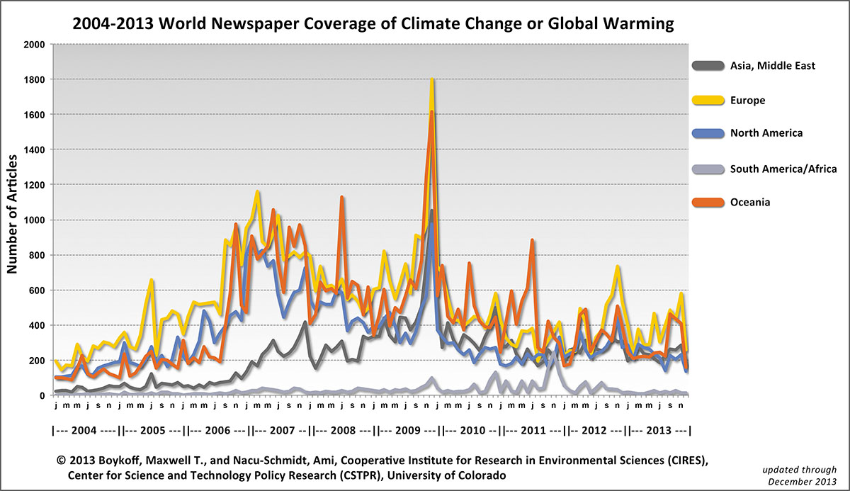
Much less inspiring, though has been the trend of media outlets of cutting whole news-desks of science and environment. Those who believed that climate change had changed the coverage forever were wrong. The interest of mainstream media on the subject had reached its peak in 2009, during the controversial negotiations at the Copenhagen Climate Summit. See the image

A good language for journalism as well

Haiti and the help of georesources

The tragedy caused by the earthquake in Haiti has proved that there is a large number of resources that can be used to a good coverage and, actually, help the people hit on the ground.

In terms of good tools that have been used to help the people. I would mention the updates made by Google and GeoEye with high resolution pictures of Porto Principe, the capital of Haiti.

Click here to see on your Google Earth

Besides that, the map build through hundreds of alerts by Ushahidi has proven to be both a strong information and aid system

Finally it is important to say that the press have benefit itself for the large amount of information generated. I particularly liked the job done by The New York Times which allow people to easily compare the satellite pictures
And one thing more, just remembered. On journalism skills. It is possible to follow earthquakes in real time by using the US Geological Service interactive map

Sea Dragon good for satellite images

The microsoft programme Sea Dragon it is proving to be an unique tool for exploring satellite images. Web users can interact and explore the details of the image in 2D format as they do with Google Maps.

See this test I did with a image from Paraguai and Brazil

If this script does not work try to see this test I did at O Eco

The image was downloaded from the Modis Subsets, as soon as we know that there fires happening in Manaus.

I believe Sea Dragon will help quite a lot

Back to track

I have been away of using this platform for updating news on geojournalism. But here I am , back to the track. And the news are good enough to keep things going here. First, an invitation, if you reading this post, consider following geojournalism on twitter @geojournalism. Second is to say that projects that involve use of satellite image are becoming more frequent and that we, at O Eco website – http://www.oeco.com.br, are now involved on using ESA’s images. I tell you more details soon

Geonews released

I just launched a broader project of geojournalism at O Eco (http://www.oeco.com.br/geonoticias). It is called Geonotícia (Geonews, translanding from Portuguese). It is much more complete than the previous experience (http://www.oeco.com.br/monitor) because finaly I managed to use the Earth directly on the website. The idea is to produce a story over the Google Earth.

But also I will be exploring the satellite images in a simple way. Basicaly the idea is to bring ground information to what the pictures are showing from the sky.

Journalism and the democratization of satellites

My friend James Fahn, who is the mentor of the Earth Journalists Network (EJN), has sent me an interesting article published at e360. Written byRhett Butler, it tells how satellites images have been made acessible latetly for a wider audience and how this is helping to improve conservation. There is a lot of good information about the work that Mark Mulligan, professor at the King´s College London, is doing with the help of Google Earth. I myself have written a story for O Eco about his Healthy Planet.  Also, Butler has remembered how Brazil is leading the use of environmental satellites to track deforestation and how, with the advent of REDD,  this might be a good opportunity of improving forest surveillance.

However, I fell like doing a post-scriptum for e360 article by defending my team here. Journalists are doing good use of the satellites and the geoweb tolls. I have shown in some posts bellow how useful it might be to tell a story about deforestation just spotting fire pixels in a map. Also how powerful it is to grab a image from the Modis Subset website and interpret it by yourself. I think the  idea about having journalists doing this is having a complete different approach to these images, which use to be within a black box not long time ago.

Well, maybe I talked too much about what I have done by using these tools. So here is a tip for one the best geoweb stories done so far.  It tells about the shirinking of the Aral Sea. You can download it here. (open in the new version Google Earth 5.0 – click here to update)

If you want to have an idea of what you going to see. Just watch the video bellow

Climate Change Multimedia

If you are interested on how communicate climate change in a good and appealing way, it is worth have a look on the new web site launched by the Jet Propulsion Laboratory. As I said before, Nasa is doing good journalism and we have some stuff to learn with them.

Take a look – http://climate.jpl.nasa.gov/

Fires in South East Asia

NASA Modis image of fire pixels all over Cambodia

NASA Modis image of fire pixels all over Cambodia

This week NASA´s Earth Observatory used an shocking image of fire pixels in Southeast Asia. The image was captured by the Modis Sensor used both in Aqua and Terra satellites. I fowarded the image to some friends at Climate Change Media Partnership and got interesting feedbacks. Navin Khadka, from BBC Nepali Service, wants to see if such a thing was also happening at the Hindu Kush Himalayan range. I fowarded some images that I could find at the Modis Rapid Fire Subsets website.

Then Hilary Chiew, reporter from The Star, in Malaisya, decided to contact some sources in Cambodia to check if the information that honey gatherers were really responsible for fires as NASA has stated on their image explanation. But their sources, remembered that there is no evidence that honey collection could cause large forest fires.

Well, the thing I would like to highlight here is that joining the image with some good questions we can build some interesting stories.

Geojournalism and citizen journalism

The trends of geojournalism and citizen journalism are quite similar. Both are increasing and starting to involve more people. Here I give two examples.

First, it was really interesting the post by Andrew Revkin at his Dot Earth Blog about the launch of the Ocean`s layer on the Google Earth. Some of you might have seen that now it is possible to travel around the world’s marine environment. What Revkin is discussing its is whether or not this effort of bulding a virtual world is going to lead to more conservation.

Take a look on the article here.

The other thing that has impressed me a lot is the Ushahidi software. It is a kind of automatic mapping of facts reported by citizen. They have amazing experiences already completed on the Congo and the Gaza conflicts. It is worth having a look on it. Here